
Customers are no longer starting on Google. A growing share of them open ChatGPT, Perplexity, or Google's AI Overviews, type a question - "best [your service] near me," "who should I use for X," "what's the best [product] for [situation]" - and read the answer. Two or three businesses get named. The rest are invisible. That invisibility is the unsettling part. When you lose a Google ranking, you see it happen in your analytics. When an AI tool recommends your competitor to a thousand potential customers, nothing shows up in any report you currently run. Ranking well on Google does not mean you'll be cited by AI. Research suggests the overlap between top Google results and AI-cited sources is shrinking fast. You can be the number-one organic result and still never get mentioned in the answer. The first step isn't to fix it. It's to find out where you stand. Here's how to do that in under an hour.
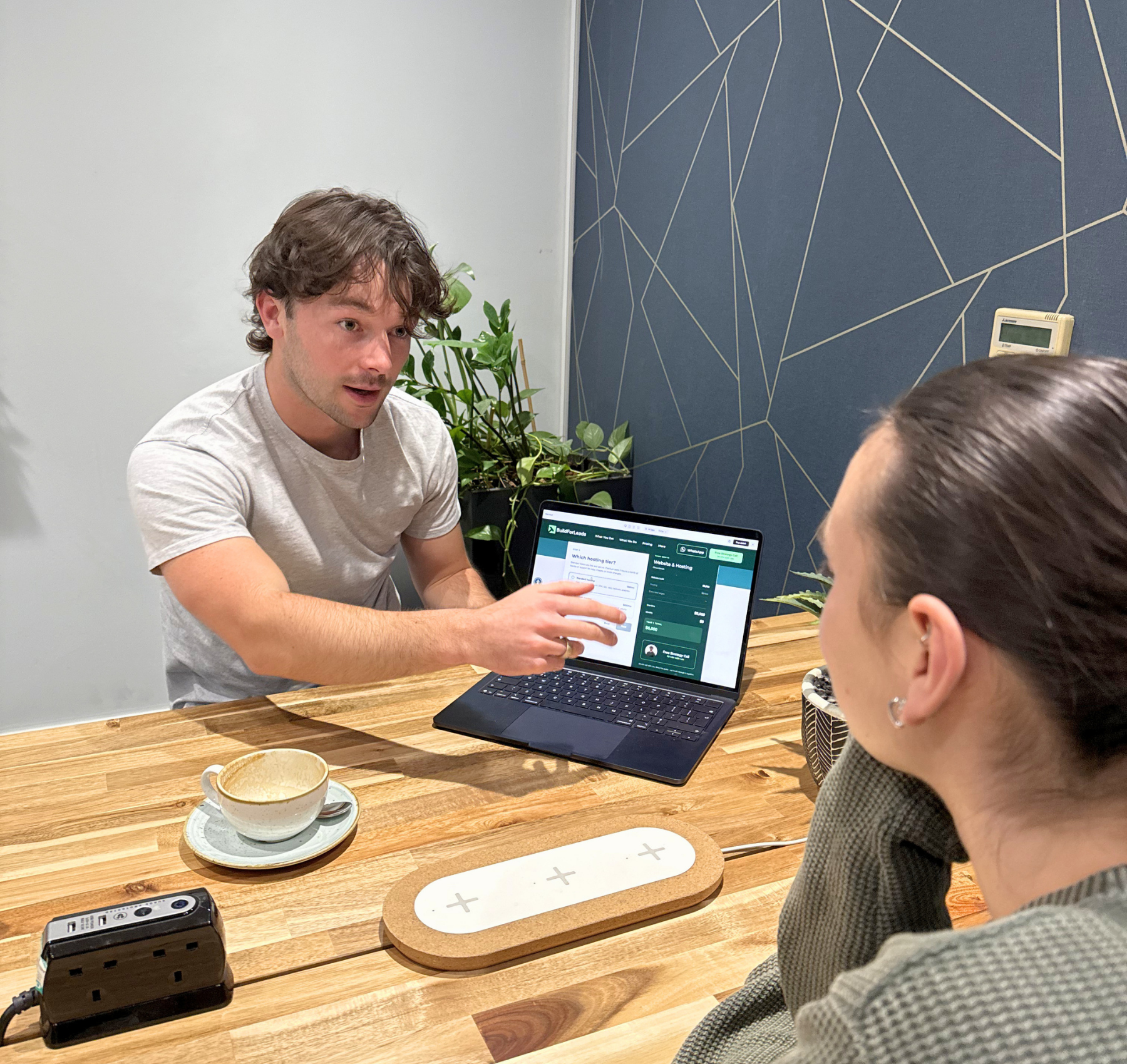
Most TMS clinics spend their marketing budget getting patients to enquire. The website, the SEO, the ads - all of it exists to turn a stranger into someone who picks up the phone or fills in a form. Then the enquiry comes in, and the system that worked so hard to create it quietly drops the ball. This is the part of patient acquisition almost no clinic measures, and it's where a lot of expensive marketing goes to die. You can have the best website in your market and still lose the patient in the gap between "I'm interested" and "I've booked." Here's how that gap opens up, and what closing it actually looks like. The patient isn't waiting for you. They're comparing you. When someone enquires about TMS, they are rarely enquiring with one clinic. They're anxious, they've usually exhausted other treatment options, and they're doing what anyone does with a high-stakes decision - looking at several providers at once. That changes everything about what happens next. The patient who fills in your form at 2pm isn't sitting by the phone hoping you call back. They've also messaged the clinic across town, and maybe a third. Whoever responds first, clearly, and warmly is the one who gets the conversation. The others are competing for a patient who's already half-committed elsewhere. The research on this is consistent across industries: the large majority of customers end up going with whoever responds first - not the cheapest, not the most credentialed, but the first. For a TMS clinic, that means the quality of your care is irrelevant to the patient who never heard back in time to consider it. Speed is the variable nobody is managing The uncomfortable truth is that most clinics have no idea how fast they respond to enquiries, because nobody owns the number. A form comes in. It lands in an inbox that someone checks between patients. A voicemail sits until the front desk has a quiet moment. An after-hours enquiry waits until the next morning - by which point the patient has already spoken to someone else. None of this is negligence. It's just what happens when enquiry response is everybody's job and therefore nobody's job. The marketing generated the lead; the clinical team is busy treating patients; the front desk is managing a waiting room. The enquiry falls into the space between them. The clinics that convert well aren't working harder. They've simply decided that responding to an enquiry is a defined job with a defined target - minutes, not hours - and built a small amount of process around making that happen reliably. After-hours is where the most patients are lost Here's the part that's easy to miss. A meaningful share of TMS enquiries arrive outside clinic hours - evenings, weekends, the moments when someone finally sits down, opens their laptop, and decides to do something about how they've been feeling. That timing is not a coincidence. It's often when the patient is most motivated. And it's exactly when most clinics are least equipped to respond. If your only response mechanism is a person checking an inbox during business hours, every evening and weekend enquiry cools for twelve hours or more before anyone touches it. By Monday morning, the patient who enquired on Friday night has had a whole weekend to talk to a competitor, change their mind, or lose the nerve it took to reach out in the first place. This is the single biggest fixable leak in most clinics' patient acquisition, and it has nothing to do with the website..
Choosing a marketing partner is one of the more expensive decisions a healthcare clinic will make, and one of the easier ones to get wrong. Most agencies tell you the same things. More traffic, better SEO, more patients. The pitches are interchangeable, the case studies sound similar, and the monthly fees are often comparable. The differences only become clear six months in - after the contract is signed and the budget is spent. Here's what actually separates a good agency from the right one. Does the agency understand healthcare specifically? Healthcare marketing is not the same as marketing retail or e-commerce. Patients searching for care are anxious, often researching during difficult moments, and weighing decisions with real consequences. The messaging that works for a furniture brand does not transfer. A healthcare-experienced agency understands: Patient decision-making and the emotional weight behind clinical searches Compliance constraints around medical advertising The trust signals that matter on a clinic website How to write about conditions and treatments without crossing clinical or legal lines A generalist agency will treat your clinic like any other client . That usually shows. Worth asking: how many healthcare clients have you worked with in the past two years, and what types of clinics? Are they leading with strategy or tactics? A lot of agencies open with a deliverable. A new website. An SEO package. A monthly ad spend. The tactics are real, but they're being offered before anyone has asked what your clinic actually needs. A strong marketing partner starts with strategy. They want to understand your growth goals, your current patient pipeline, your geographic reach, and where the competitive pressure is. Those answers decide whether you should prioritise local SEO, paid search, landing pages, content, or some combination. Without that foundation, the marketing becomes reactive - a series of tactics chosen because they're what the agency happens to sell. Worth asking: how would you approach our clinic in the first 30 days, and what would you want to understand before recommending anything? How transparent is the reporting? A marketing partnership should not feel like a black box. Every month, you should know: What work was done and why Which objectives it was tied to How is performance being measured What's being adjusted based on the data If the monthly update is a dashboard of impressions and clicks with no narrative and no link to patient enquiries, you are paying for activity rather than outcomes. Worth asking: can I see a sample of the monthly reporting you provide to clients?
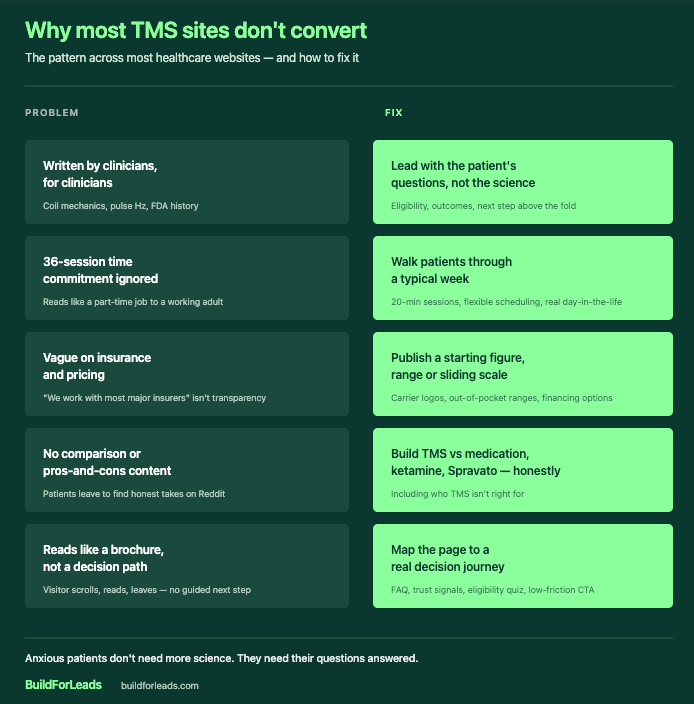
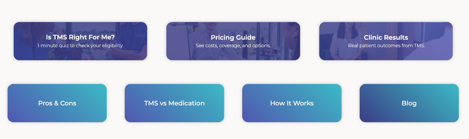
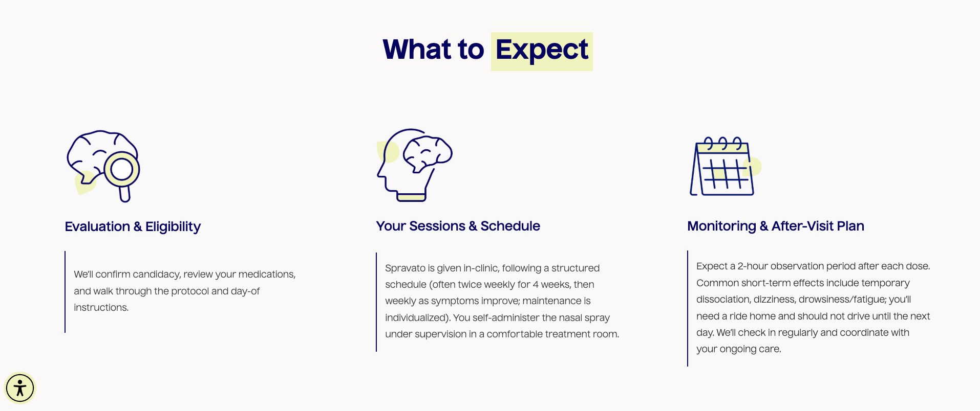
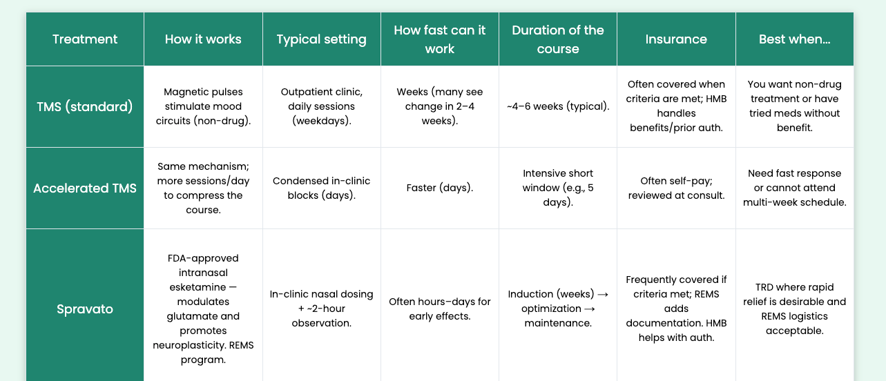
For a clinic offering more than one interventional psychiatry treatment, the patient on your website isn't asking "should I try TMS?" - they're asking "which of these is right for me?" That second question is harder. It's also the one most clinic websites quietly fail to answer. This post is about the cross-treatment decision logic patients are actually running through when they land on your site — and what a website built for that decision looks like in practice. What are patients comparing when they land on your site A patient researching interventional psychiatry rarely arrives knowing which treatment they want. They arrive somewhere along this spectrum: They've tried two or three medications, none of which have worked well, and a friend or their psychiatrist mentioned "you should look into TMS or Spravato" They've read about ketamine therapy somewhere and want to know if it's the same as Spravato (it's not, quite) They've heard about accelerated TMS or SAINT and want to know if that's faster than the standard protocol They've seen Spravato advertised, called their insurance, and are now confused about whether they qualify The thing every one of those patients has in common: they're comparing treatments before they're comparing clinics. A typical example: a clinic offers TMS, Spravato, and IV ketamine. The website has three service pages, three different contact forms, and a single "Book a Consultation" CTA across all of them. A patient with treatment-resistant depression lands on the homepage, doesn't know which of the three applies to her, opens all three service pages in separate tabs, and leaves twenty minutes later more confused than when she arrived. None of the three pages helped her choose. That's the gap. If your website only presents TMS, Spravato, and IV ketamine as three separate service pages with their own CTAs, the patient still has to do the comparison work themselves. Most won't. They'll leave, go to Reddit or WebMD, and come back to a different clinic that helped them choose. The three decisions patients are actually making Each cross-treatment comparison comes down to a specific set of questions. Clinic websites that convert well address each one directly. TMS vs antidepressant medication Most patients arriving at an interventional psychiatry clinic have been on medication for a while and aren't getting the response they hoped for. They want to know: Is TMS a replacement for my medication, or do I stay on it? How is the effect different from a new pill? Will the relief last after the six-week course ends? What does the day-to-day actually look like compared to taking a pill? Most TMS service pages explain the neurological mechanism. Almost none explain what the patient should expect compared to their current medication. That gap is where the inquiry is lost. Spravato vs IV ketamine This is the comparison most likely to be searched and least likely to be answered well on clinic websites. The two treatments are pharmacologically related but operationally very different: Spravato is FDA-cleared for treatment-resistant depression, administered in-clinic as a nasal spray, observed for two hours after each dose, and covered by most commercial and government insurance plans with prior authorization. IV ketamine is administered as an infusion, typically over 40 minutes, and is almost always cash-pay because most insurance plans don't cover off-label ketamine infusions for depression.
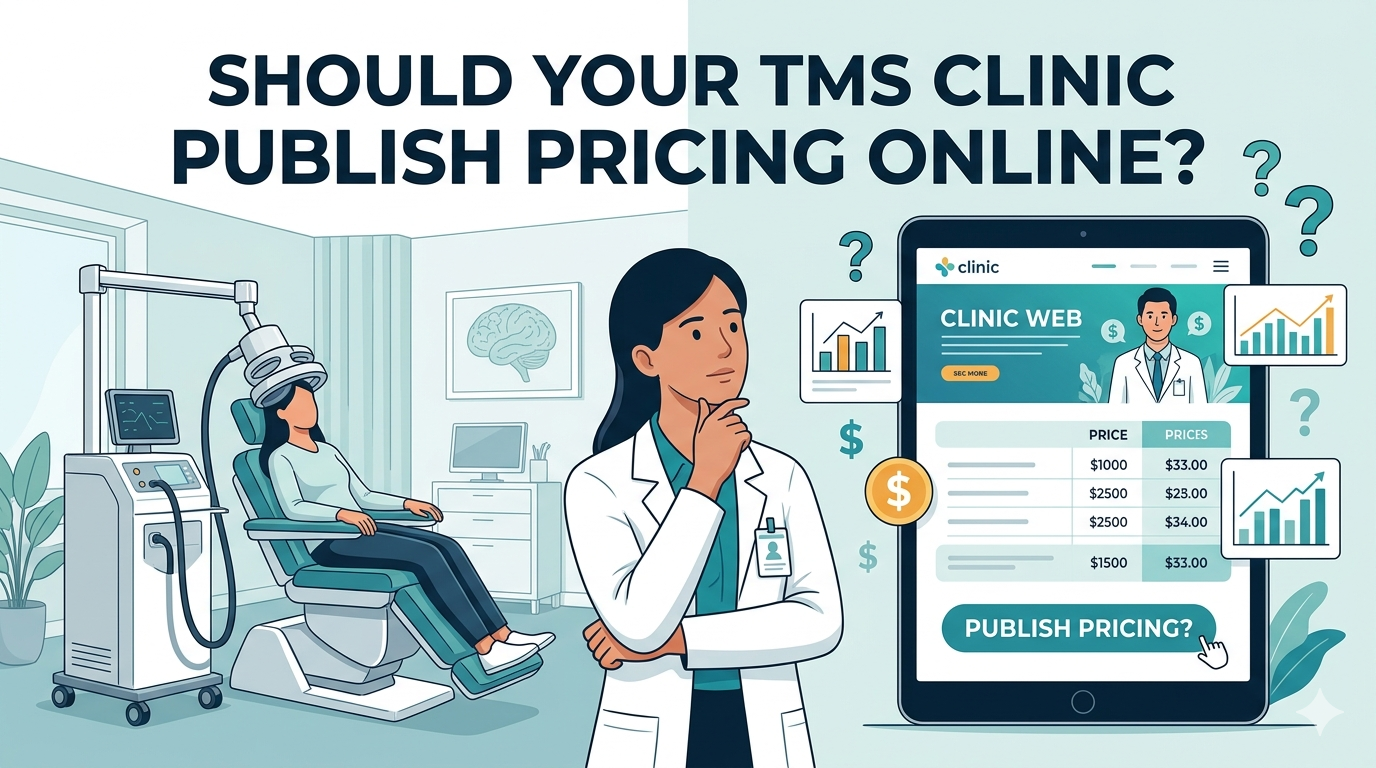
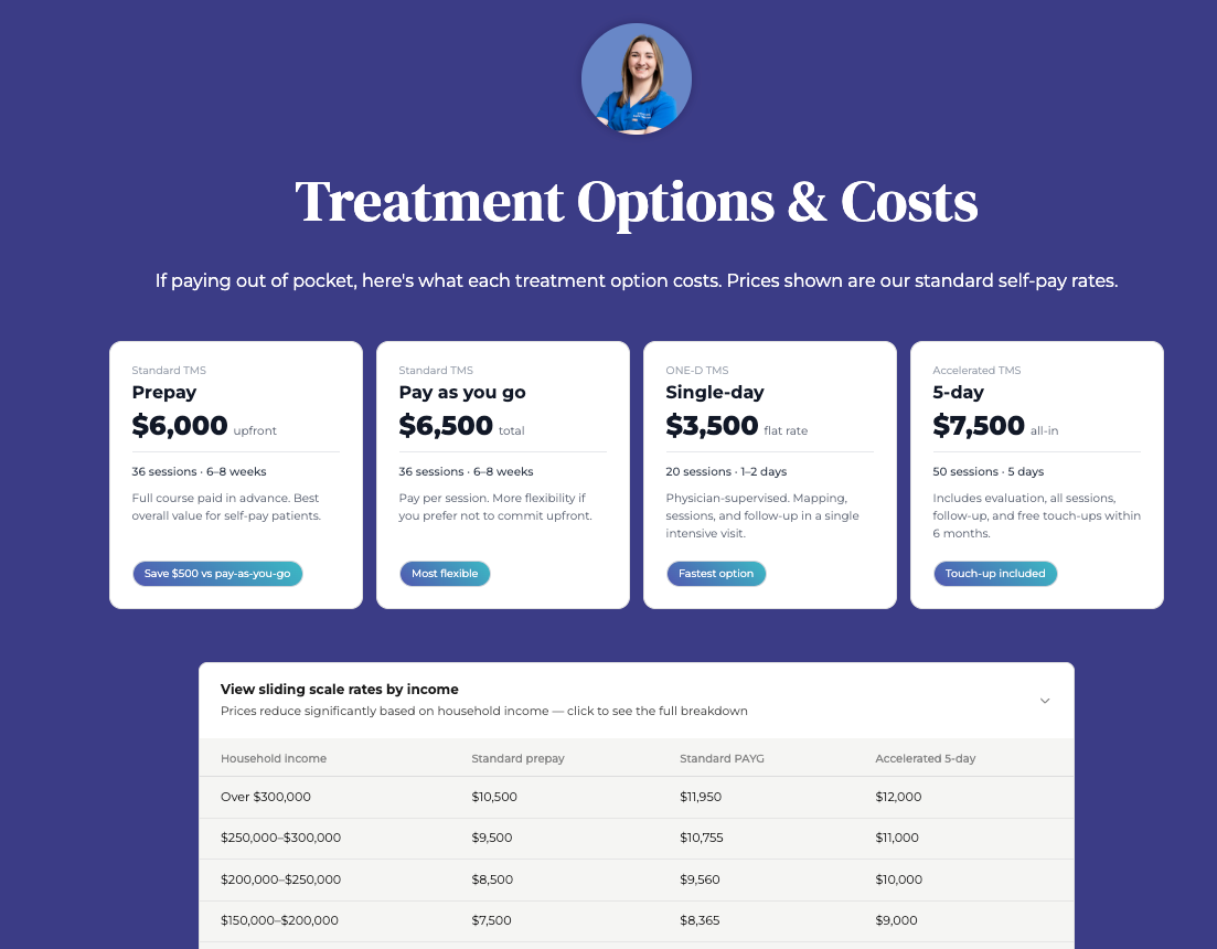
The short answer is yes. The longer, more useful answer is that the question is the wrong question. The clinics' ranking for searches like "accelerated TMS cost" has already moved on from that debate - their pricing is on the page. The question they're asking is harder: How do you publish pricing when fees vary by insurance, protocol, income, and whether the patient prepays? That's what this post is about. Not whether to publish - that ship has sailed - but how to do it without losing insurance-paying patients or painting yourself into a corner you can't update later. Why "we work with most major insurers" doesn't count Most TMS clinic websites have something that gestures vaguely at pricing. "We accept most major insurers." "Contact us for a personalised quote." "Costs vary depending on your treatment plan." That's not transparency. It's hedging dressed up as helpfulness. A patient searching "how much does TMS cost" doesn't need to be told that costs vary. They know that. They want a number (any number) to anchor their thinking against. Without one, they leave and find a clinic that gives them one. Increasingly, that's also what Google rewards. Search any high-intent TMS cost query, and the top organic results are clinics publishing real figures. The clinics still hedging are nowhere on the first page.

Every form submission, every phone call into your front desk, every "anything else you'd like us to know" field - that's patient research most marketing teams would pay thousands for. It's already happening at your clinic, every day, for free. Almost nobody reads it. This is the gap between a TMS clinic that gets sharper every quarter and one that stays exactly where it was on launch day. The clinics pulling ahead aren't the ones with the cleverest websites. They're the ones paying attention to what patients are actually asking. What forms tell you Most clinic websites have a contact form with a free-text field - "tell us briefly what you're looking for." That field is the most valuable single piece of marketing data your clinic produces. Almost no one reads three months of it in one sitting. Here's what happens when you do.
Open Google. Search "new roof near me." Look at the filters Google offers you before you've even scrolled. "Online estimates" is the first one. Before "Within 5 mi." Before "Open now." Before "Top rated." That ordering is not random. Google has decided that for high-cost service queries, the single most important refinement a user wants is the ability to filter out businesses that won't tell them what something costs. If your business is one of those, Google now has a button that removes you from the results. This is not a roofing problem The same filter logic is showing up across high-consideration service categories. Home services. Healthcare. Legal. Anything where the customer is anxious about cost before they're anxious about anything else. Google is reading user behaviour at scale. It sees that people abandon searches when they can't get a sense of price. It sees that people bounce off websites that hide cost behind a "Contact us for a quote" form. And it's responding by surfacing the businesses that give the user what they actually want - a number, a range, a starting figure, anything to anchor the decision. The businesses that publish pricing signals are getting rewarded. The ones that don't are being filtered out. The "we don't publish prices because every job is different" argument This is the response I hear most often, and it's worth taking seriously. In some industries, it's genuinely true. A complex commercial fit-out, a bespoke legal case, a custom software build - these resist clean pricing because the inputs vary too much. But in most service businesses, this argument is doing something else. It's protecting the business from having to compete on price by forcing every prospect into a sales conversation before they have any information. The customer doesn't experience that as a careful consultation. They experience it as evasion. And here's the uncomfortable part: the customer is usually right. Most service businesses can publish a starting price, a typical range, or at minimum the price of their most common package. They choose not to, because the silence preserves margin in negotiations. That trade-off used to work. Google is now charging a price for it, and the price is your visibility.

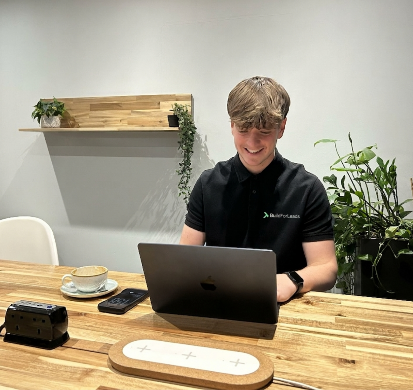
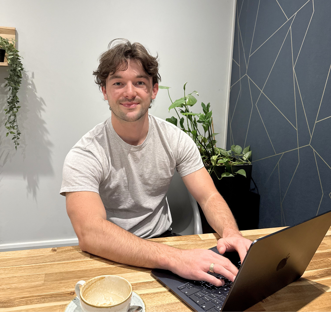
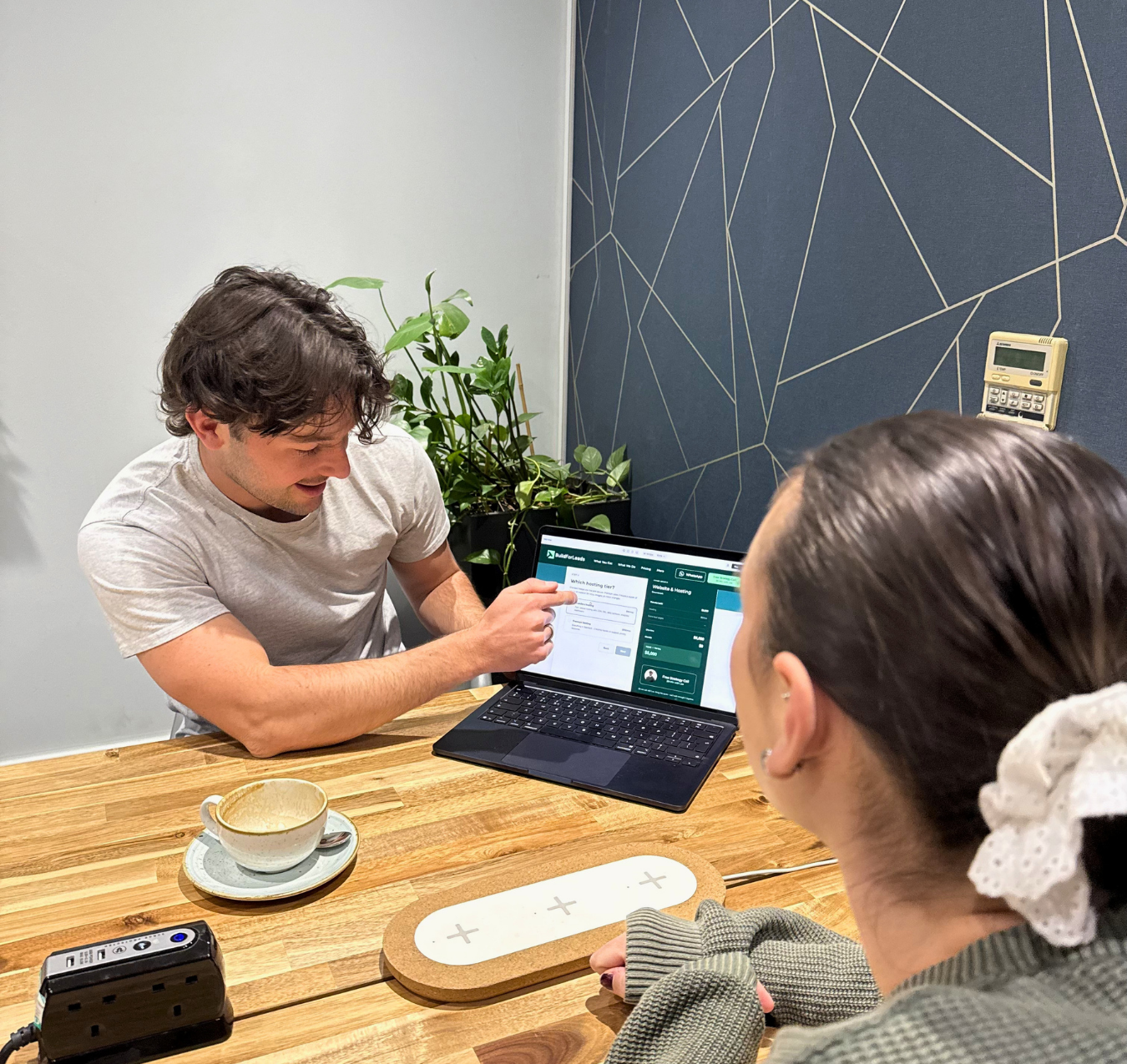
Most healthcare websites open with the same image: a clean-cut stranger mid-laugh against a soft-focus background. It's supposed to communicate warmth, care, and happiness. For the people actually landing on your site, it does the opposite. Who's actually on your website? Nobody visits a healthcare website in a good mood. They're anxious. They're in pain. They've been putting off a decision for weeks or months. They've tried other things that didn't work. They're researching a diagnosis they don't fully understand, or weighing up a treatment that scares them. That's the emotional state you're designing for. A stock photo of someone beaming at a salad doesn't meet that person where they are. It tells them you don't know what they're going through - and in a category built entirely on trust, that's the one signal you can't afford to send. What real photos do that stock can't There are three things that a photo of your actual clinic, your actual team, and your actual treatment space does that no stock image will ever do. It answers the real question. Every patient wants to know the same thing before they book: what is this going to be like? They've read about the procedure, the recovery, the waiting room. They're nervous. A photo of the actual space, the actual equipment, and a calm patient in the actual chair demystifies the experience before they've picked up the phone. You've cut half the friction out of the consultation. It signals you're a real practice. Stock photos are free and universal, which means the clinic down the road is using the same twelve images you are. Real photography of your equipment, your space, and your team communicates something stock never can: this place exists, these people work here, this treatment is happening. That's table stakes for legitimacy. It differentiates you. Every generic healthcare website uses the same visual language - smiling models, clasped hands, sunlight through windows. If your site looks like that, you're invisible. Real photos are the fastest way to not look like everyone else.